Heatmaps provide a visual summary of activity concentration. Whether it’s tracked subject movement or the frequency of event submissions directly on the EarthRanger map.
Color gradients ranging from violet to red indicate intensity:
- Violet = low activity
- Red = high activity
This visual tool makes it easy to identify where most activity is taking place, helping you prioritize efforts and improve situational awareness.
You can configure Heatmap settings from the top-right corner of the Map View, including:
- Sensitivity: Controls how many reports must accumulate before colors intensify. (Low to High)
- Radius: Defines the distance around each tracked point where the heat effect will apply (10–20,000 meters)
Adjusting these allows for finer or broader heat signatures depending on your area of interest.
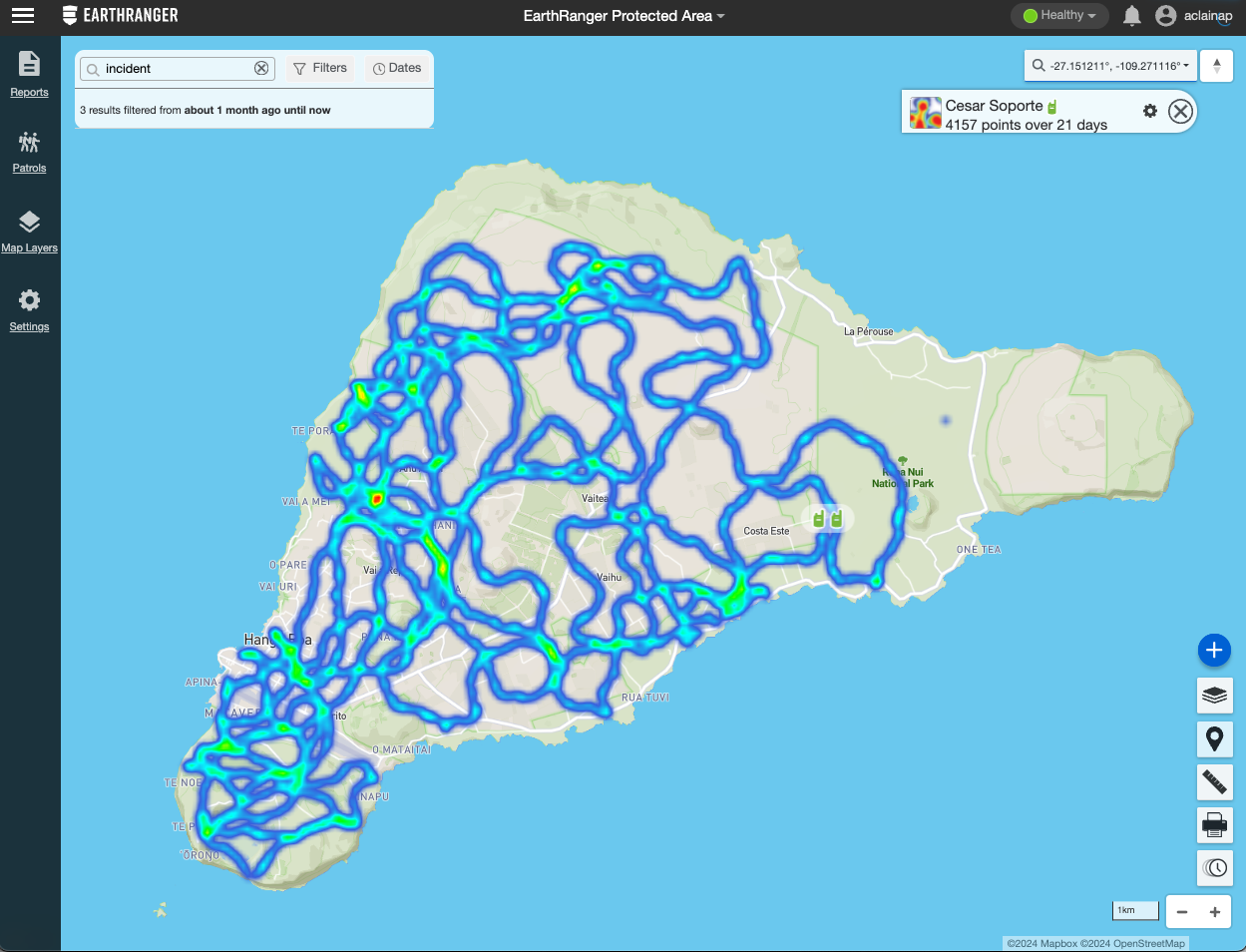
Heatmaps for Tracked Subjects
EarthRanger allows you to generate Heatmaps based on tracked subjects, which can help illustrate movement patterns over time.
- Sensitivity settings determine how easily color transitions occur.
- Lower sensitivity highlights even sparse data; higher sensitivity requires more concentrated activity to trigger intense colors.
This is especially useful for identifying commonly traveled paths, nesting zones, or territorial behaviors in wildlife.
How to Activate Heatmaps
You can activate Heatmaps in several ways:
-
Map Layers Panel:
Toggle Heat Maps on for an entire subject layer. -
Individual Tracked Subject Properties:
Open a subject from the map and select Heatmap from the available options to display activity for just that subject. -
All Visible Reports:
Use the Map Tools to generate Heat Maps for every report currently visible, helping to assess cumulative event density.
Use Cases for Heat Maps
- Identify areas of frequent patrol activity or coverage gaps.
- Detect report clustering, such as frequent poaching alerts or equipment failures.
- Monitor wildlife migration routes and behavioral patterns.
- Visualize human-wildlife conflict zones based on incident density.