User setting for Report attachment image quality
We're putting you in control of your photo uploads! Introducing the Photo Quality View: a new setting that lets you choose the resolution of photos taken from your device before they're uploaded to EarthRanger.
Choose from three options to suit your needs:
- High for the best clarity
- Medium for a balanced quality and size (this is the default)
- Low for quicker uploads and less data usage.
How it works?
- Head to Settings View and you'll find a new list item called "Photo Quality."
- Tap on it, and you'll be taken to the Photo Quality View where you can select your preferred resolution.
- Once done, simply tap the back button to return to the settings page.

Allow editing of pending sync Reports
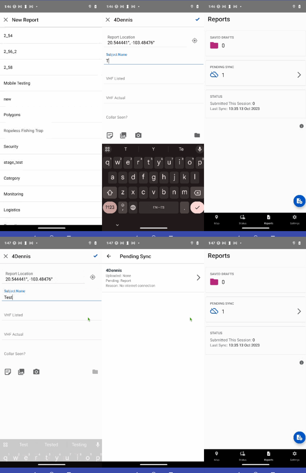
We understand that things change and sometimes you need to make updates. That's why now, if your Report hasn't been uploaded yet (it's in 'Pending Sync'), you can easily go back, open it, and make any necessary edits. Look for the new carat ( > ) symbol on the Report info card. This indicates that the Report is accessible for editing.
How it works?
- Head to the Reports Pending Sync View section.
- Any Report with a carat symbol can be tapped on to open and edit.
- After editing, you can resubmit your Report

Ensure Patrol titles are not empty
Previously, if users entered only spaces for the Patrol name in the app, it would display a blank title. However, on the web, the Patrol would display its default type as the title. This inconsistency is now fixed.
What's New:
The app now reflects the same Patrol name behavior as seen on the web.
If spaces are entered as the Patrol name, both the app and web will use the Patrol type name as the default title.
Steps to Experience the Change:
- Start a Patrol.
- In the Patrol start view, try entering only spaces for the Patrol title.
- Start the Patrol and let it upload.
- Notice that both on the app and web, the Patrol title will now default to the Patrol type name.

User friendly image attachment names
To make things clearer and more intuitive, we've changed the way we name image attachments that are created from your device's camera. Instead of a jumble of characters, you'll now see a meaningful name that gives you an immediate idea of when the image was taken and what it relates to.
Instead of random characters, if you take a photo for a rainfall Report on September 12, 2023, at 2:30:25 pm, the image will be named: 2023-09-12_14-30-25_rainfall_Report.jpg.
Send logs/db by default when Reporting an issue
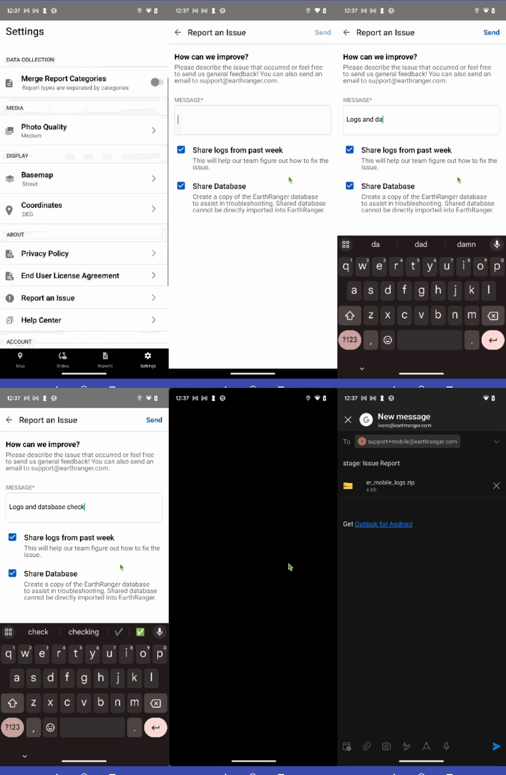
To make support smoother and faster, when you Report an issue through our SettingsView, the system will now automatically include the logs from the past week and a snapshot of the database. This means less back-and-forth between you and our support team, leading to quicker resolutions!
If for any reason you don't want to share these, simply uncheck the boxes before submitting your issue. However, including them often helps us help you faster.

Display login loading view in full screen
Now the loading image in SyncLoaderView now covers the entire screen. No more white bars at the top and bottom to interrupt the view.
We've ensured that status icons pop by changing their color to white. They'll overlay directly on the image, making them clearly visible against the backdrop.

Localized coordinate unit names
We’ve added translations for the Coordinate Unit Names to cater to a wider audience. You can now view coordinate units in Portuguese (PT), Spanish (ES), French (FR), and Swahili (SW) without any change to the actual acronym.
Example:
For Spanish users EN: DEG (Decimal Degrees) becomes ES: DEG (Grados Decimales)
How it works?
When you set your app to one of the supported languages, the Coordinate Units View will automatically show unit names in your chosen language.
Remember, while the unit descriptions change, the acronyms remain consistent across all languages.

Remove caret from Settings that navigate to internet while device offline
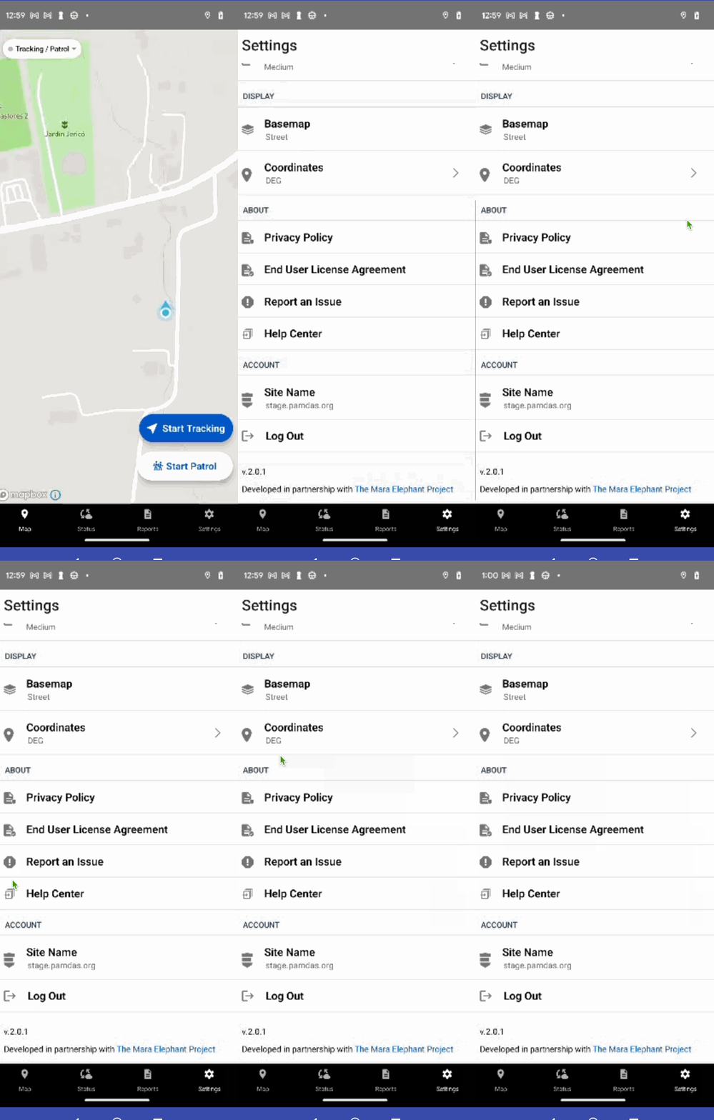
To avoid confusion and enhance the user experience when offline, certain sections in the SettingsView will now appear non-clickable.
In the About section of SettingsView, when your device is not connected to the internet, you will no longer be able to tap on the following options:
- Privacy Policy
- End User License Agreement
- Report an Issue
- Help Center
The caret (arrow) next to these options will disappear, indicating they are not available for navigation.

Reports view messaging when no Reports permissions
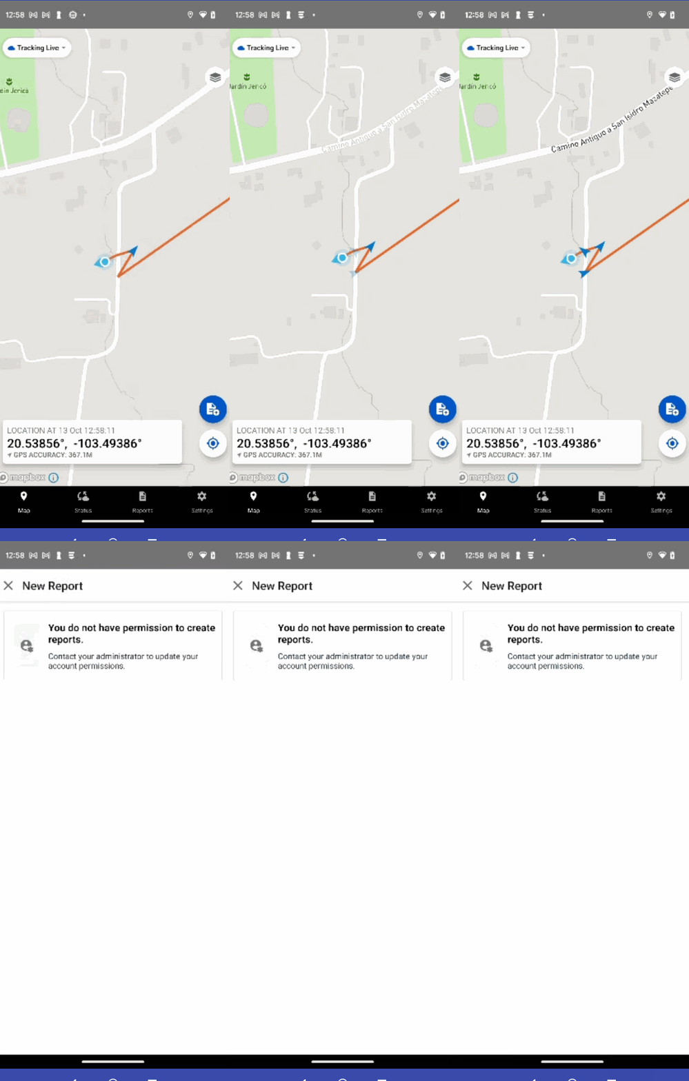
Some users, due to their token permissions, may not have the ability to create Reports. Previously, these users saw an empty view, potentially leading to confusion.
What's New:
We've now introduced a dedicated view that clearly explains why certain users can't access Report categories or types.
Instead of an empty view, users will see a message indicating they don’t have permissions to reate Reports.

Collection fields show display names
There was an inconsistency where the collection field showed the "value name" rather than the intended "display name" in selectors.
What's Fixed:
The app now consistently shows the "display name" in the collection field, ensuring uniformity across the platform.
Disable multiple collection fields creation
Some of our Android users have noticed that the collection fields were slow to respond, sometimes feeling unresponsive. This delay even occasionally led to multiple unintended views opening due to multiple taps.
What's Fixed:
We've optimized the responsiveness of the collection fields for Android devices.
Now, tapping on collection fields will result in a swift response, preventing the chance for multiple views to open accidentally.
Pending sync Patrols/Reports filters by active user
We've made some behind-the-scenes tweaks to speed up how quickly the app can show you the number of Reports and Patrols that are waiting to be synced.
When you check the StatusView and ReportsView, you'll notice the counts of Reports and Patrols that are pending load even faster than before.
Use exponential retry mechanism for attachment upload retries
Previously, if an image upload failed, the system would make three immediate successive attempts to re-upload. Now, we've incorporated an exponential backoff strategy to introduce increasing delays between these retries, thereby optimizing for a statistically higher chance of success.
Updated last sync text when nothing has synced
Previously, when Patrols, events, and tracked observations were not yet synced, the app indicated the "Time of Last Sync" in the status view, potentially leading to confusion. This behavior has now been improved for better clarity.
What's New:
Instead of displaying "Time of Last Sync to ER", the app will now show "Not yet synced" when certain data hasn't been synced, providing a clearer understanding of the data status.
The text "Not yet synced" has been translated and is available in Spanish (ES), Portuguese (PR), Swahili (SW), and French (FR) for our international users.
